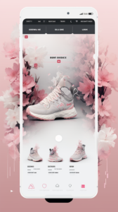
In the quaint town of Basingstoke, nestled in the heart of the UK, resided a talented website designer named Emma. She had an uncanny ability to weave colour into her web designs, creating websites that not only looked stunning but also resonated deeply with their viewers. Emma’s secret? A deep understanding of colour psychology in web design.
One fine morning, Emma was approached by a new client, a medium-sized business specializing in natural skincare products. The client wanted a website that would not only showcase their products but also evoke a sense of calm, trust, and nature.
Emma knew that the right colour palette could achieve this. She embarked on a journey to choose the perfect colours, understanding that every hue had its own psychological impact.
- Understanding Colour Psychology: Emma began by revisiting her knowledge of colour psychology. She knew that colours could evoke different emotions and reactions. For instance, blue was often associated with trust and security, making it a favourite for banking websites. Green, representing nature and tranquility, could be ideal for her client’s natural skincare line.
- Research and Inspiration: She spent hours researching and seeking inspiration. She looked at nature, art, and even movies, understanding how different colour combinations worked together. Her love for mid-journey explorations in various art forms provided her with unique perspectives and ideas.
- Creating the Colour Palette: After extensive research, Emma decided on a palette that combined earthy greens, soft blues, and neutral tones. The greens would evoke a natural and organic feel, essential for the skincare brand. The blues would add a touch of trust and reliability, while the neutrals would provide balance and a sense of calm.
- Testing and Feedback: With the palette selected, Emma created mock-ups of the website. She presented these to the client, along with explanations of why each colour was chosen and how it tied into the brand’s identity and values. The client was impressed with the thought process and how the colours embodied their brand’s essence.
- Implementation and Launch: Emma then meticulously applied the colour palette across the website, ensuring consistency in shades and tones. She paid close attention to contrast for readability and accessibility, a crucial aspect of web design often overlooked.
- The Power of Colour: The launch of the website was a resounding success. Users felt instantly connected to the brand, and the client reported an increase in engagement and sales. The calming greens and blues, balanced with neutral tones, created an environment that encouraged visitors to explore and stay longer on the site.
- Reflection and Learning: Emma reflected on the project, proud of her work. She realized that the right colour palette could transform a simple website into a powerful communication tool. It wasn’t just about aesthetics; it was about evoking the right emotions and creating a connection with the audience.
From that day onwards, Emma continued to harness the power of colour psychology in her web designs, helping brands tell their stories more effectively. Her work in Basingstoke gained recognition, not just for its visual appeal, but for its ability to connect with viewers on a deeper, more emotional level. And through her designs, Emma demonstrated the profound impact that the right palette can have in the world of web design.


What do you think?
It is nice to know your opinion. Leave a comment.